
Panda and reverse panda: The story of two colours
Why panda and reverse panda dials? From diving chronographs to the racing circuit, three manufacturers’ accounts reveal the practical needs behind contrasting colours.
Two Colours, One Glance — Panda and Reverse Panda
The story of panda and reverse panda dials. Turkish narration with Turkish and English subtitle options.
Photographs and visual adaptations: Dnalor 01 / Wikimedia Commons · CC BY-SA 3.0 AT. Jeff Stein / Wikimedia Commons · public domain. The Seiko photograph and image-based adaptations retain the same license. Animations are not original archival footage.
A face designed for a glance
Imagine standing beside a racing circuit. An engine draws closer. You have a chronograph in your hand; you are about to press a pusher, then read the elapsed time. This is hardly the moment to study a watch at leisure. Today we enlarge a photograph to admire a dial. In that instant, all you want is to find the information you need.
A light surface, dark circles: to an enthusiast, this dial has character. To somebody timing an event, it separates displays. One pattern, two ways of looking. Behind the face we enjoy today, what did its makers want somebody to be able to do?
What exactly are panda and reverse panda dials?
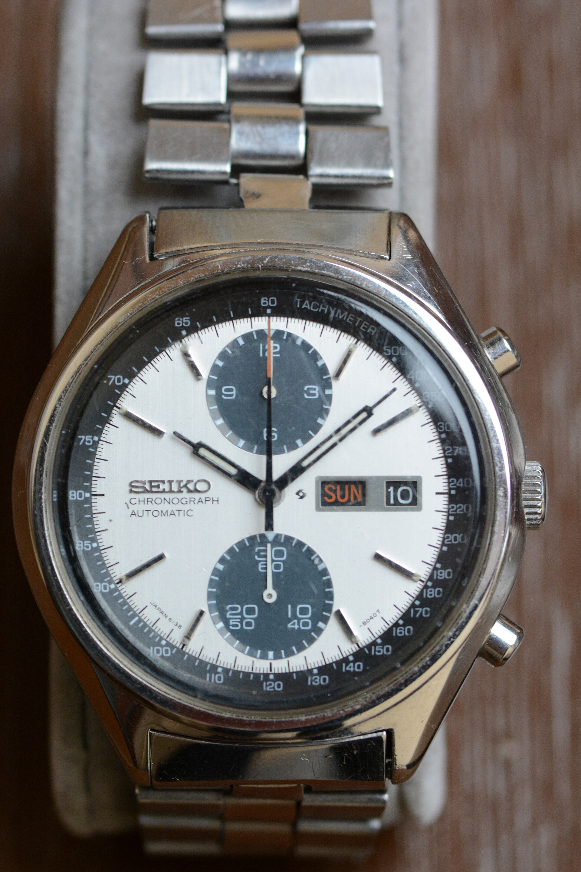
A panda has dark subdials on a light main dial. A reverse panda puts light subdials on a dark main dial. Black and white are the familiar pairing; silver tones also belong to this visual family. The name describes neither a movement nor a quality grade. Two-register watches can share the arrangement too.
The resemblance gives the panda its appealing nickname. Reverse panda describes the opposite colour arrangement; the word “reverse” tells us nothing about which design came first.
1957: The story goes underwater
According to Breitling’s history, Willy Breitling wanted a diving chronograph. The resulting 1957 SuperOcean 807 used white subdials on black to aid underwater reading. The manufacturer calls it the first reverse panda chronograph.
For the diver, those pale circles were intended as separate, readable displays. This is an early example worth remembering when “reverse” sounds like a later variation. The dates in this article trace documented examples, not an established birth order for the entire dial family.
1962: A driver’s or pilot’s glance
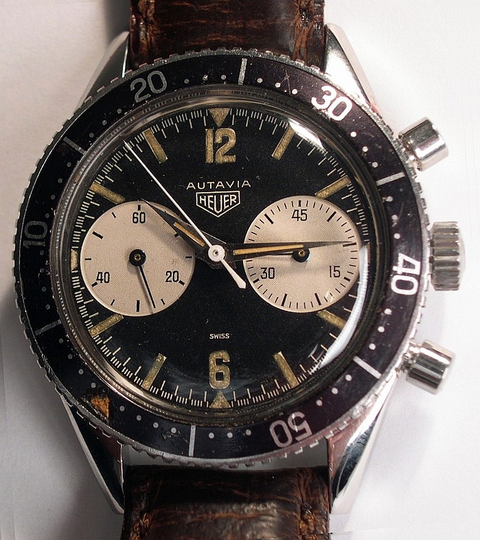
TAG Heuer’s archive recalls Jack Heuer deciding with his production team, in autumn 1961, to develop an Autavia wrist chronograph. Introduced in 1962, it had oversized white subdials on matte black, intended to improve legibility for drivers and pilots.
Return to the person timing a car at the circuit. The dial has to make sense during a short glance, with attention already on something else. Oversized registers and contrasting backgrounds address that practical problem together.
1963: Two colour arrangements, one problem
Rolex describes its 1963 Cosmograph as a chronograph for racing drivers. Its official brochure specifies both dark counters on light and light counters on black. Alongside moving the tachymeter scale to the bezel, contrast served a functional purpose: better legibility.
Not everything on a dial needs to call for our attention at once. Giving a display its own background marks out a small space for information. Think of the spacing between paragraphs on a page: the words remain the same, but they become easier to follow.
Who wanted the watch, and who gave it a name?
The manufacturers’ accounts give us three concrete answers: Willy Breitling wanted a diving chronograph; Jack Heuer and his production team chose to develop the Autavia; Rolex described functional design decisions for racing drivers. In these three examples, the shared aim was to make information easier to distinguish.
Paul Newman enters a different part of the story. Phillips describes Singer-made “exotic” Daytona dials as an alternative to standard dials; Rolex links their nickname to the actor wearing that design. Panda names a colour arrangement, while “Paul Newman” identifies a particular dial family. These sources do not document a panda-dial commission from Newman.
The late 1960s: Other interpretations
TAG Heuer’s archive dates its panda Carrera 2447 SN example to 1968, five years after the Carrera’s introduction. Hamilton also traces its Chronograph A and B to 1968. These are other examples of the visual language; their dates alone do not tell us who invented it or why every manufacturer adopted it.
Why do both arrangements work?
Dark areas on a light field and light areas on a dark field can both create separation. That is the visual idea connecting the three manufacturers’ explanations. Colour arrangement alone does not establish which watch will be easier to read.
Try looking at a watch yourself. Find the main time display, then a subdial hand. Does the hand stand out against its background? What disappears in a reflection from the crystal? You read the hand against its subdial, as well as the subdial against the main face. Contrast has to work at both levels.
A different colour arrangement need not mean a different movement: Hamilton offers its modern chronograph in both. Nor do the reviewed sources assign panda and reverse panda a general division of duties for daytime and night.
What do we time today?
Now leave the circuit and come home. This time, you press the pusher while a pot of tea brews. No grandstand, no starting line. A little hand advances across the dial; an idea that once helped with a demanding job accompanies an ordinary moment.
We do not have to live the life a vintage watch was designed for to enjoy wearing it. Understanding these practical decisions, though, changes what we notice. The black within white, or white within black, becomes more than a pattern. We see someone trying to make a small dial easier to read. Then we choose the face that feels closest to us.
Sources & further reading
This article was prepared for 1010 WatchClub using the sources below.
- Breitling — Superocean: First Dive Chronograph (manufacturer’s historical account)
- TAG Heuer — Vintage Heuer Autavia Collection
- Rolex — Cosmograph Daytona, official brochure, pp. 23–24
- TAG Heuer — Vintage Heuer Carrera; 2447 SN, 1968
- Hamilton — Intra-Matic Chronograph H; the 1968 Chronograph A and B connection
- Phillips — Rolex 6239, catalogue entry on Singer-made exotic dials